Fu Lab 
COVID-19
When and how will the COVID-19 pandemic end in the United States?
Xingru Chen and Feng Fu
Last updated: January 25, 2021
This report provides preliminary results and is work in progress. More detailed results and figures are in the Bag End. Original code and data are in the Github Repository. Old results with earlier truncation dates for parameter estimation are in the archives (see bottom of the page).
Abstract
The COVID-19 pandemic has upended everyone’s normal life, health crisis, lockdowns, and economic percussions in an unprecedented pace and scale. We will get over this pandemic but at what prices? Here we estimate the burden of COVID-19 in the United States, peak time, and total number of infections, in coming months.
Data
The data we use in our research consist of four parts: the COVID-19 infection information, the census, and the voting information of the United States as well as the migration information in China. We consider the data in a state level where 50 states as well as District of Columbia are treated as individual compartments. The start date is January 21, 2020.
Data Source
- United States
- COVID-19 information: New York Times COVID-19 Warehouse
- census: United States Census Bureau
- rural-urban continuum codes: United States Department of Agriculture
- migration information: Descartes Labs
- stock market: Yahoo Finance
- voting information: Cook Partisan Voting Index
- Mainland China
- migration information: Baidu Qianxi
- census: China Census Bureau
Data Processing
 |
|
|---|---|
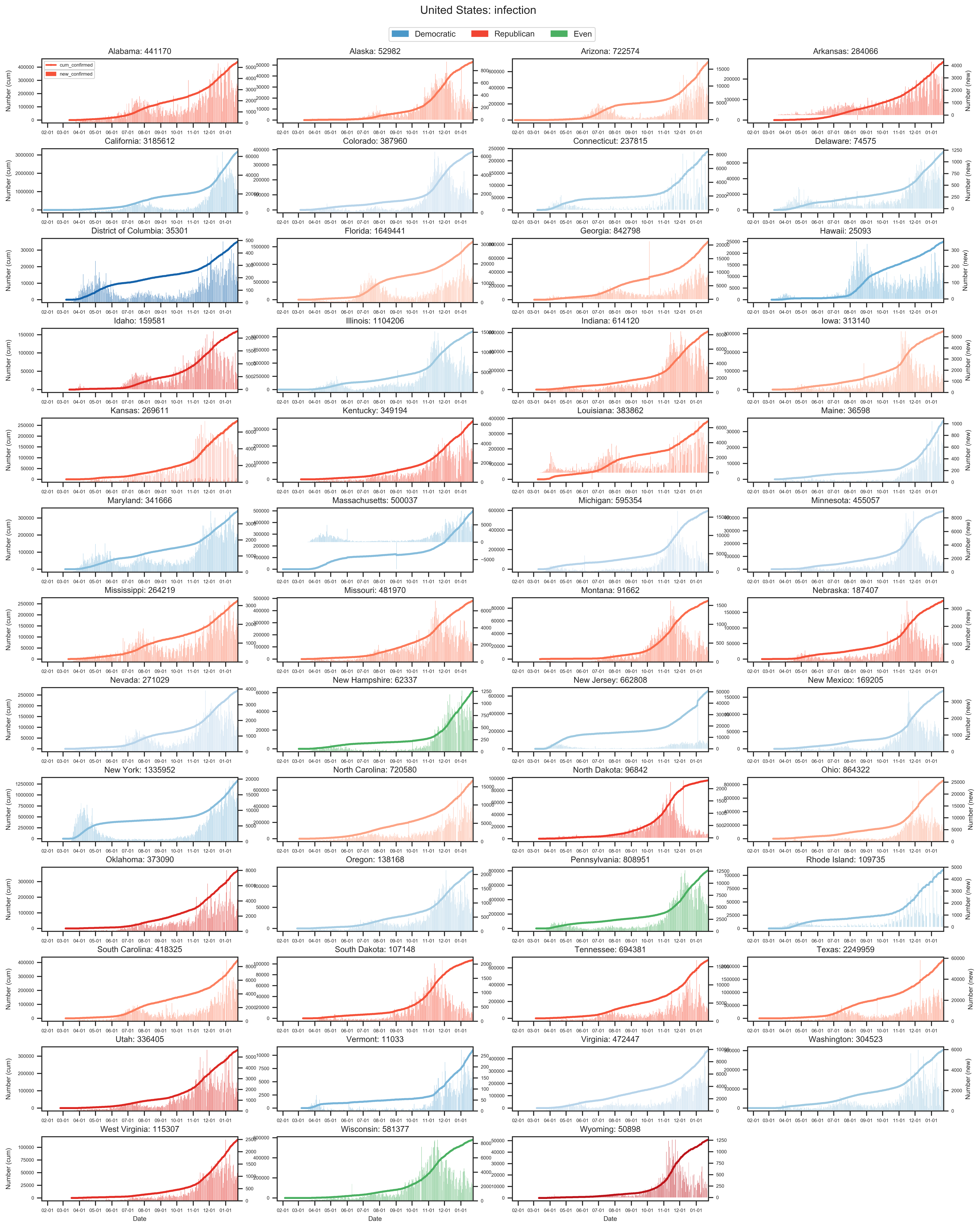
| (a) The state level of reported cases. | (c) The state level growth of confirmed cases since the first reported case in United States in Jan 21, 2020. |
 |
|
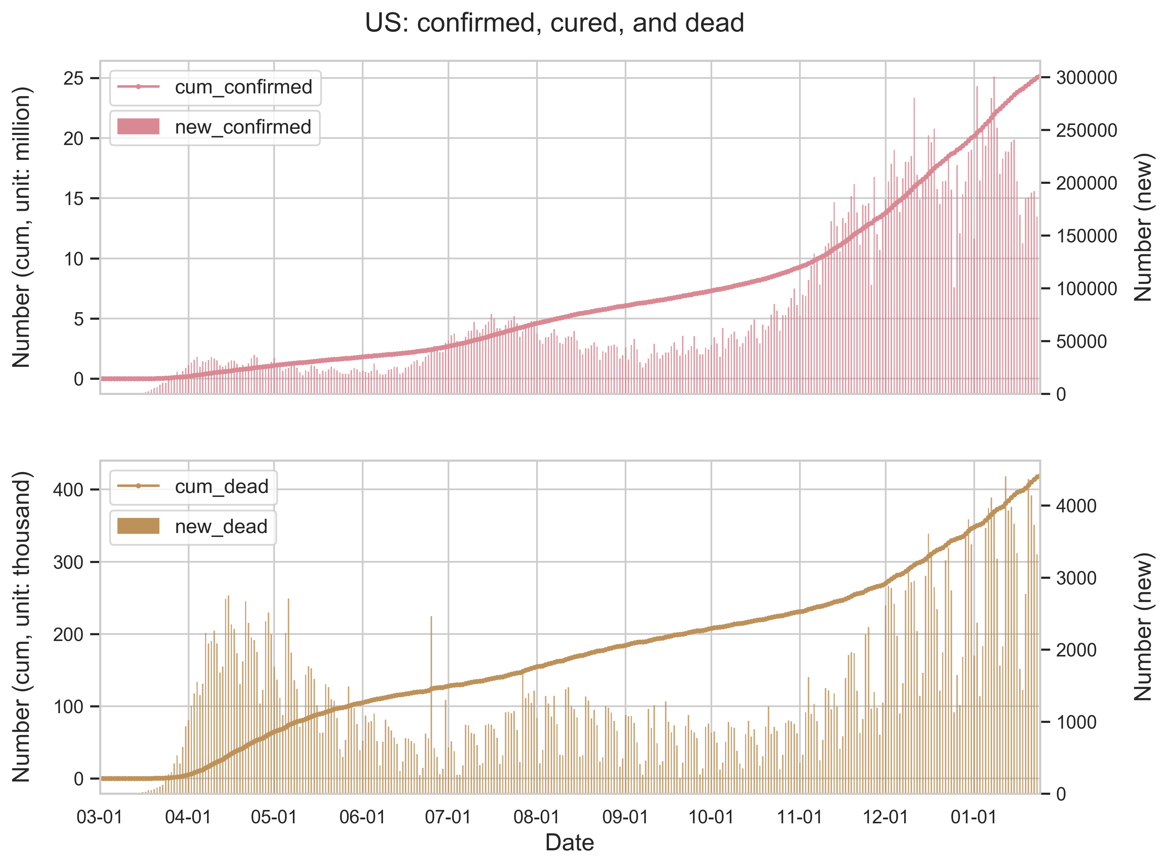
| (b) The spatial spread of COVID-19. The number of infected is displayed on a logarithmic scale. | (d) The national level growth of confirmed cases as well as deaths. |
| Figure 1: Summary of the COVID-19 information as of January 24, 2020. For (c), the curve in a panel represents the number of cumulative infected people in the state and the histogram indicates the number of new infected people everyday. The color code in (a) and (c) corresponds to the partisan voting index (PVI) by each state. | |
 |
 |
 |
|---|---|---|
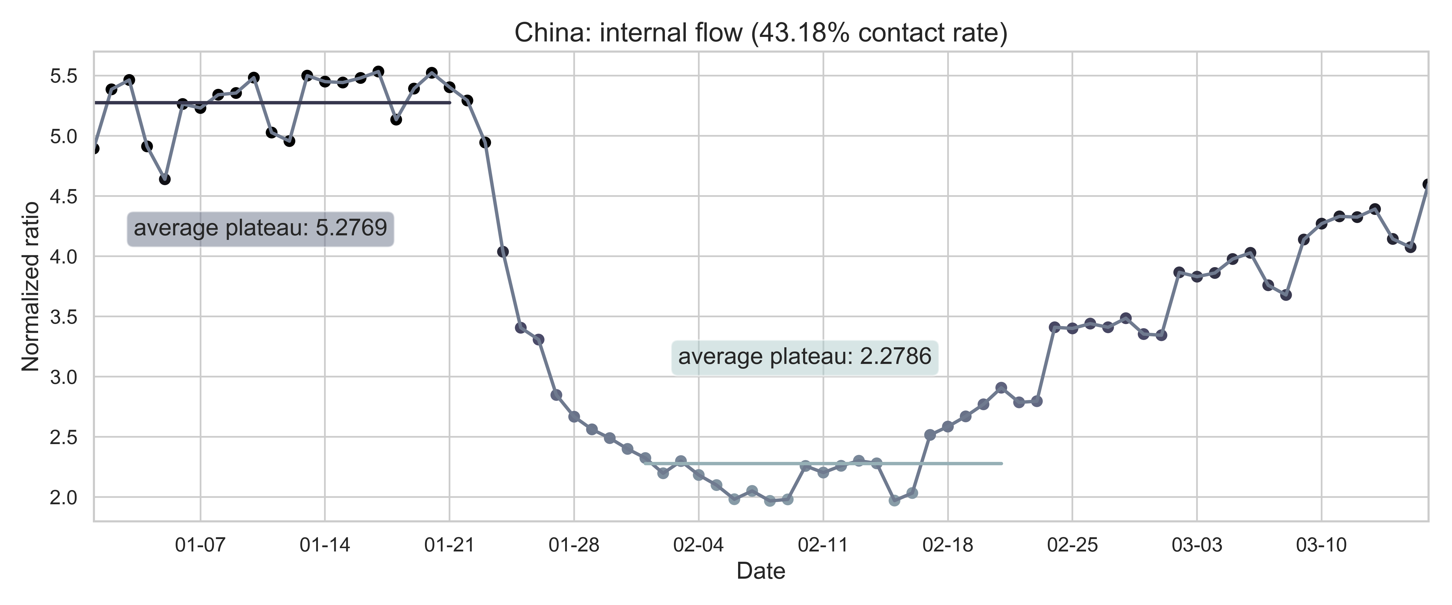
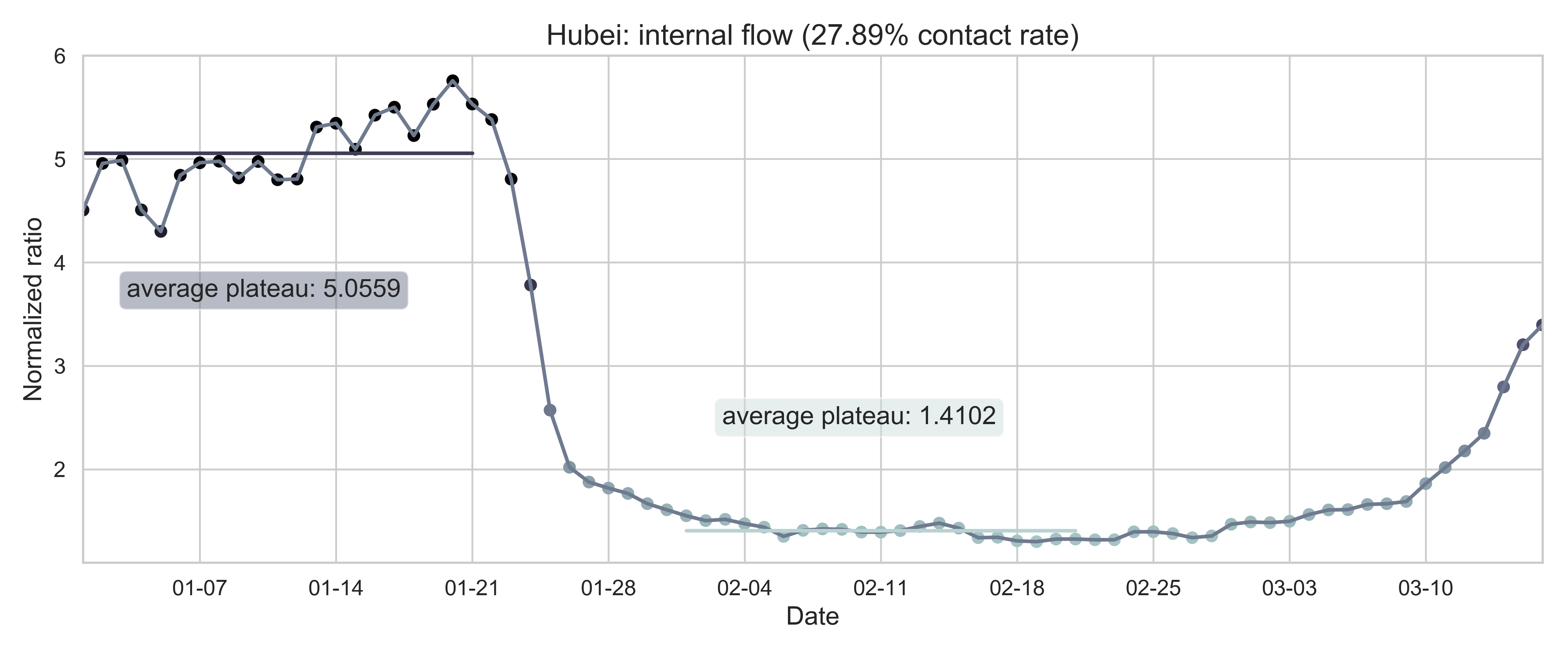
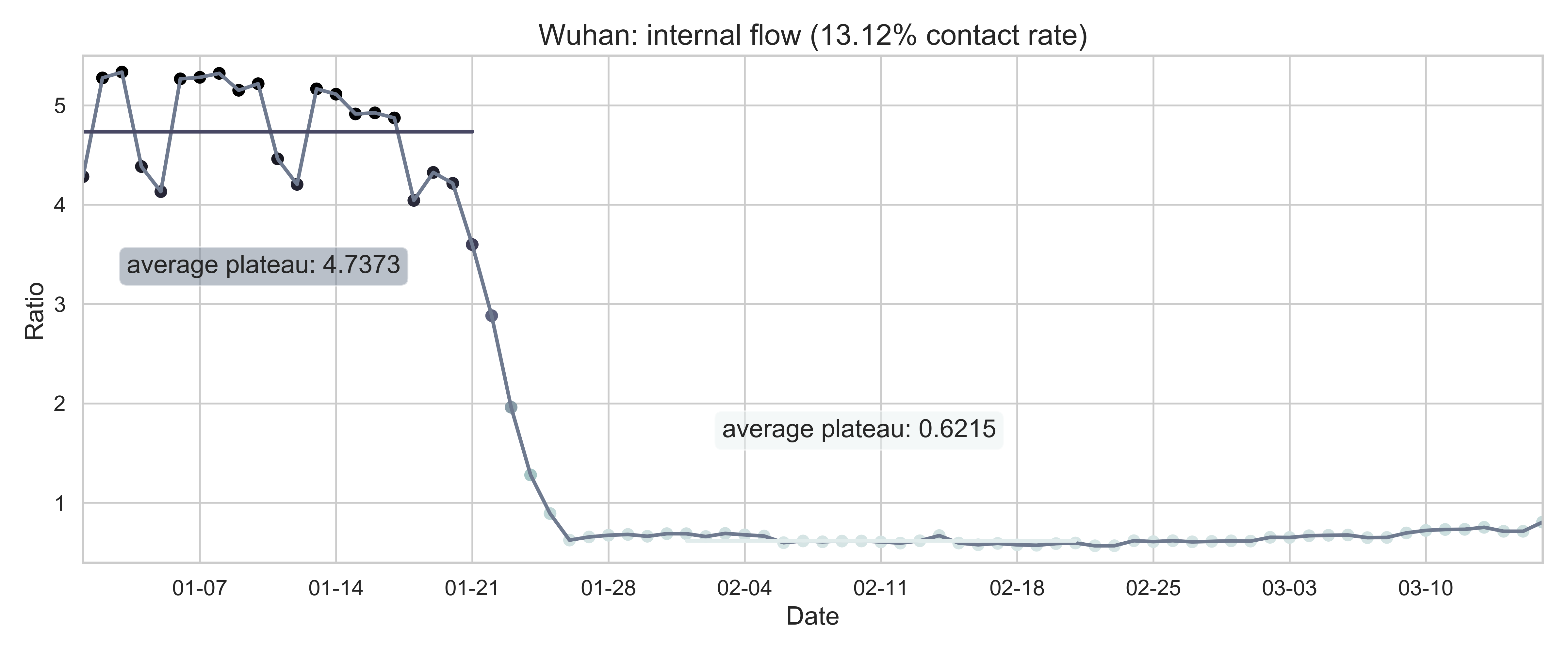
| (a) The nationwide internal-flow ratio in China. | (b) The province level internal-flow ratio in Hubei Province. | (c) The city level inter-flow ratio in Wuhan City. |
| Figure 2: The internal-flow ratios on three different levels in China. The time period for calculating the first average plateau value is from January 1, 2020 to January 21, 2020 and that for calculating the second value is from February 1, 2020 to February 21, 2020. The percentage in the title of every panel indicates the after-to-before ratio. | ||
Method
SEIR Model
We consider an SEIR model in a population structure for every state. The systems of ODEs describe the dynnamics in continuous time t, that is, days since the outbreak of the disease:
Here, the subscript $i$ refers to the $i$th compartment on the state level (in other words, the $i$th state) and $N_i(t) = S_i(t) + E_i(t) + I_i(t) + R_i(t)$ is the population size of compartment $i$.
In general, all three parameters can be time dependent, due to containment efforts (social distancing). Since time $t$ is discrete in practice, we treat these parameters as piecewise functions, of which every piece is a constant. To simplify the problem, we pick three important dates as breaking points of the piecewise functions: March 15 (since when quarantine was executed), March 29 (2 weeks after March 15 and since when more severe actions were taken), and May 17 (7 weeks after March 29 and since when states started to reopen business and public places). As a result, the function $\beta_i(t)$ is split into at most four pieces, same for $\sigma_i(t)$ and $\gamma_i(t)$:
Exponential and Power Growth
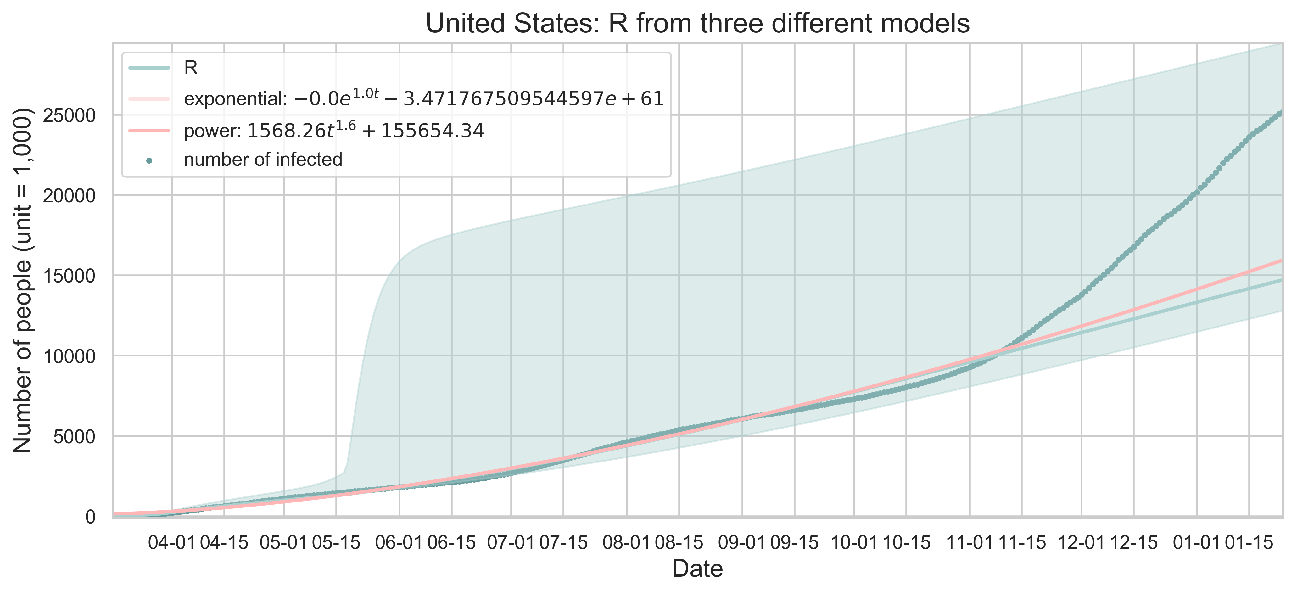
Apart from the above compartmental model, we also experiment with two popular curve fitting models: exponential and power growth. For these kind of least square regression methods, we restrict ourselves to the national cases and start the fitting from March 16 (right after the first breaking point chosen above) to fix the error in the early states of testing in every state and avoid the rapid growth of the exponential function later on.
More concretely, we assume that the general expressions are:
Parameter Estimation
We turncate the date to September 20, which is 13 weeks after May 17. Old results with earlier truncation dates for parameter estimation are in the archives.
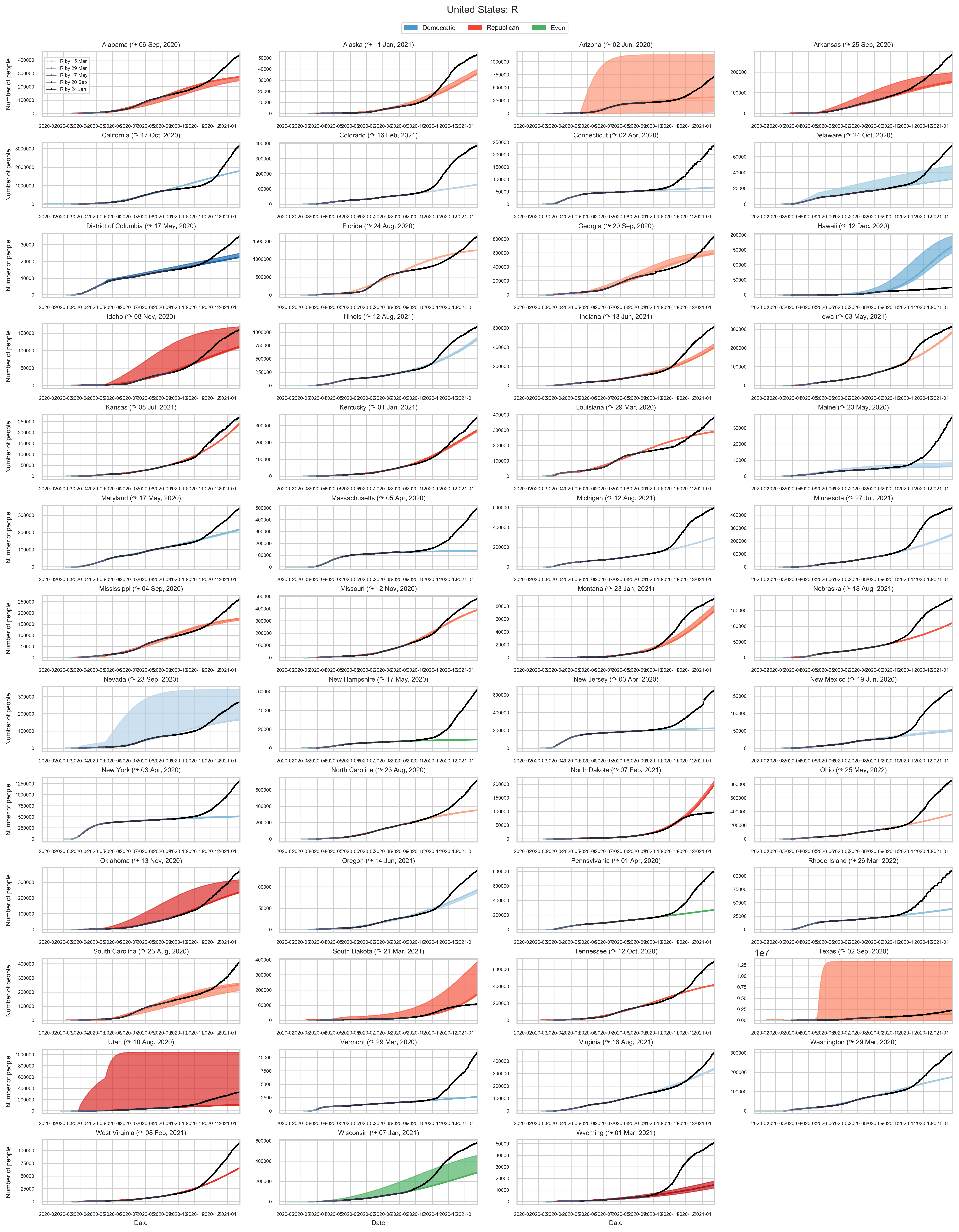
To obtain a satisfactory estimation of the epidemic parameters for the $i$th state, we apply the dual annealing algorithm to perform a nonlinear least square fitting of the variable $R_i(t)$ and find the global minimum value of the residual. The table below shows an ordered dictionary of all the parameter objects required.
| name | initial value | lower bound | upper bound | expression |
|---|---|---|---|---|
| $N_i$ | $n_i$ | |||
| $S_i(0)$ | $N_i - E_i(0) - I_i(0) - R_i(0)$ | |||
| $E_i(0)$ | 50 | 0 | 1000 | |
| $I_i(0)$ | 50 | 0 | 500 | |
| $R_i(0)$ | 0 | 0 | 100 | |
| $\beta_{ij}$ | 0.5 | 0.01 | 3 | |
| $\sigma_{ij}$ | 0.5 | 0.02 | 1 | |
| $\gamma_{ij}$ | 0.5 | 0.02 | 1 | |
| Table 1: Implementation of parameters according to the sampling of the estimates for epidemic parameters. Here, $n_i$ is the population size of state $i$. | ||||
After obtaining the prior estimation of parameters for every province, we can further calculate the covariance matrix $\text{cov}(\hat{x})$ and hence the standard errors. The covariance matrix contains complete information about the uncertainty of parameter estimators. To get $\text{cov}(\hat{x})$, we use a linear approximation method through the Jacobian matrix $F$:
Here $s^2$ is the unbiased estimation of the variance $\sigma^2$ obtained from the least square residual:
with $n$ being the total number of measurements, $p$ the number of estimated parameters, $n - p$ the degrees of freedom, $N$ the population size and $S_\text{min}(r, \hat{x}) = \displaystyle\sum(r - R(\hat{x}))^2$ the minimum value of the objective function (that is, the least square residual).
To get an error bar, we apply the Monte Carlo sampling method to generate a sample set of parameters, feed them into the ODE equations and produce enough outputs where we choose the 0.005 and the 0.995 quantiles as the lower and upper bounds.
 |
|---|
| Figure 3: Cumulative incidence of COVID-19 cases in every one of the 50 U.S. states (D.C. is also included) as well as projected increase and peak time based on real data. The error bar is also shown in every panel. |
We can compare the SEIR model with the least square regression methods.
 |
|---|
| Figure 4: All three models: SEIR, exponential growth and power growth. The start date of the fitting is March 16, 2020. Scatters indicate the actual number of infected people and the curves are the corresponding results of least square fitting. The error bar is shown for R. |
Discussion on Contact Rate
The experience of China has already shown that strict quarantine can reduce the contact rate and hence suppress the epidemic. To perform some predictions with the case in the US, we can consider different compliance levels of social distancing.
Discrete Variation
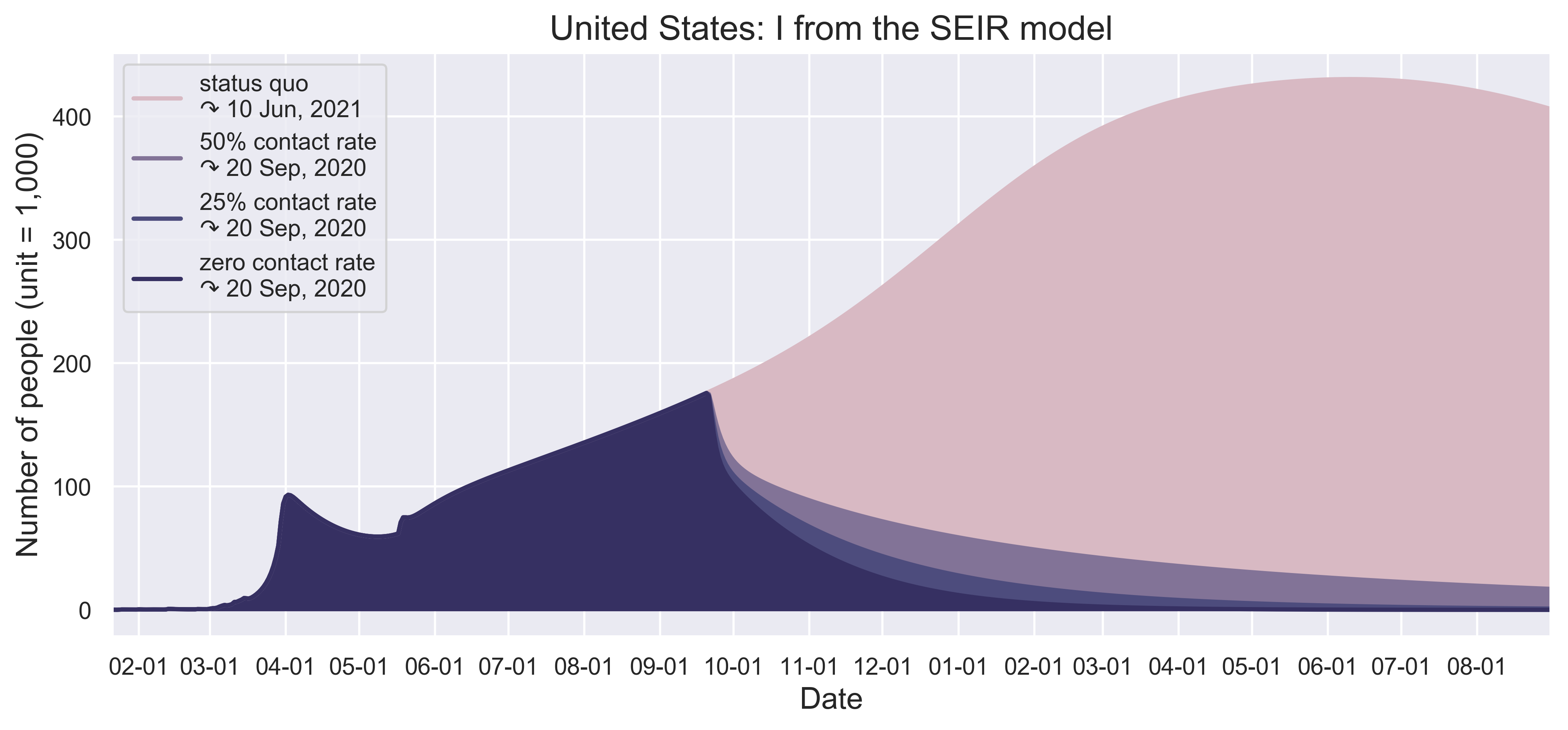
We first work on four discrete threshold values of contact rate reduction: 100% (status quo), 50%, 25% and 0 (complete lockdown).
| (a) Status quo contact rate as a result of social distancing. | (b) 50% reduction. |
| (c) 75% reduction. | (d) zero contract. |
 |
 |
| (e) When will the inflection points come? | (f) When will the curves be flattened? |
| Figure 5: (a) to (d) present the spatiotemporal spread of predicted COVID-19 on December 1 with different scenarios of contact reductions due to control measures instituted in each State and by the federal government. (e) and (f) show the growth patterns of the number of infected people. | |
 |
|---|
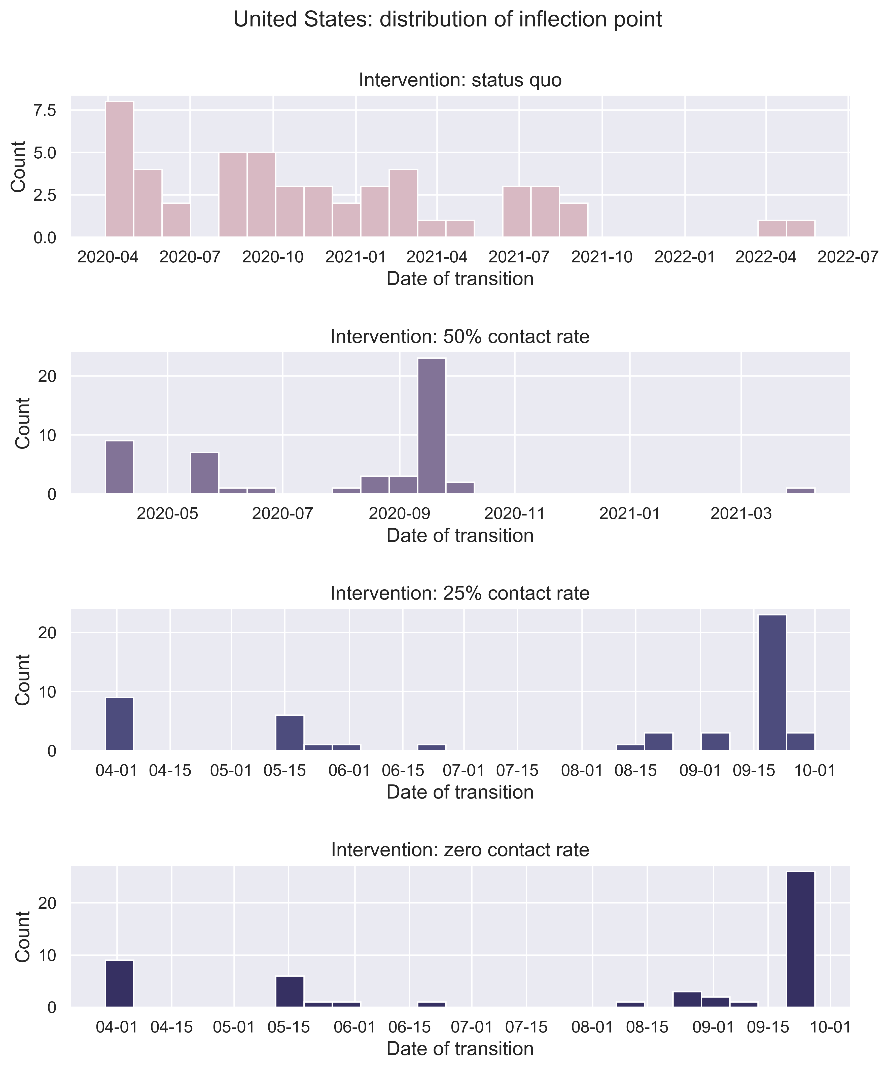
| Figure 6: When will the inflection point come? Or it may have arrived for certain states. We consider the distribution of the date on which a state will encounter the peak value of number of new infected. |
A detailed result for every state is given below.
 |
|---|
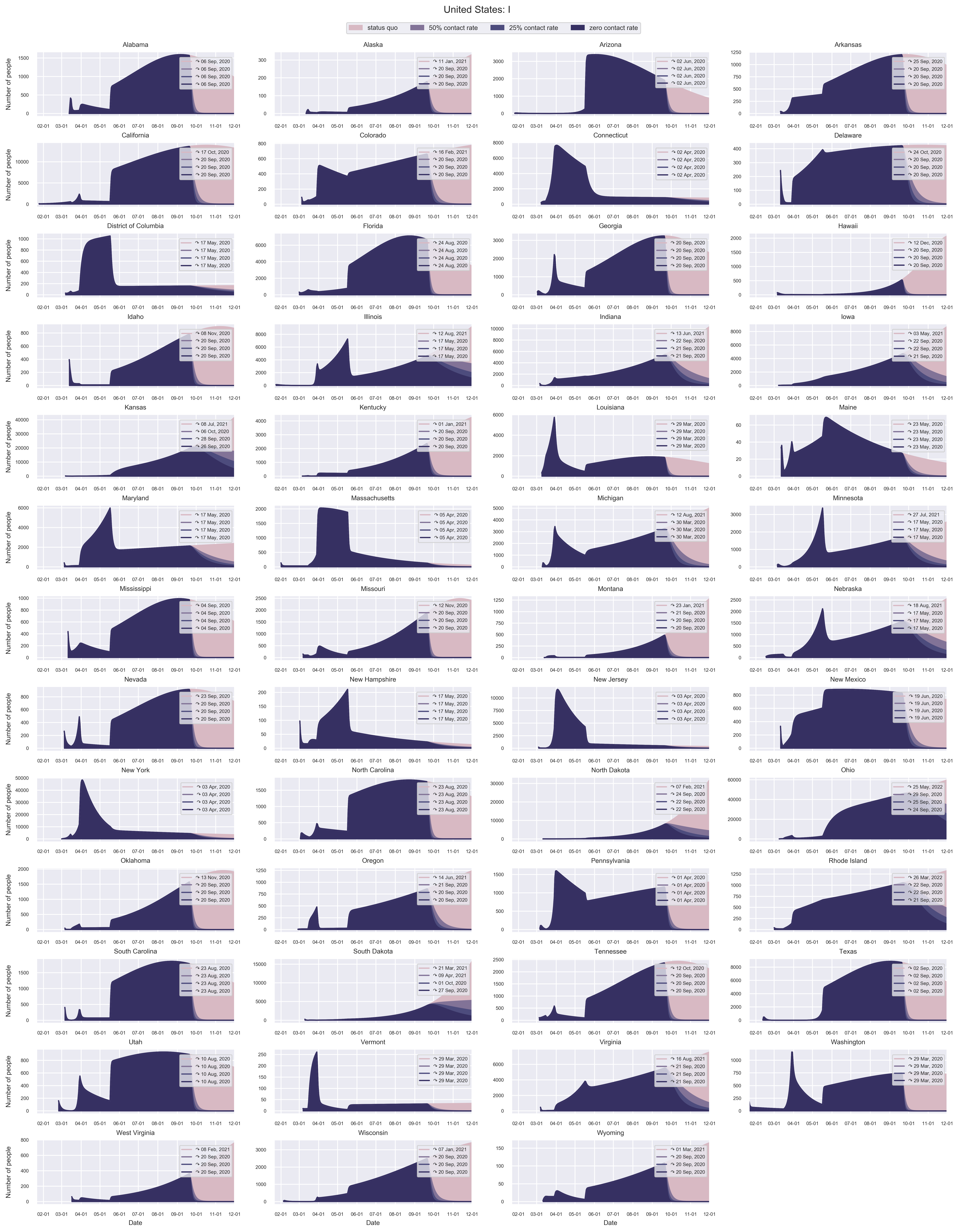
| Figure 7: Flatten the curve under contact rate reductions for different compliance levels of social distancing. In the figure legend, we show when the outbreak of COVID-19 in each state will peak under different scenarios. |
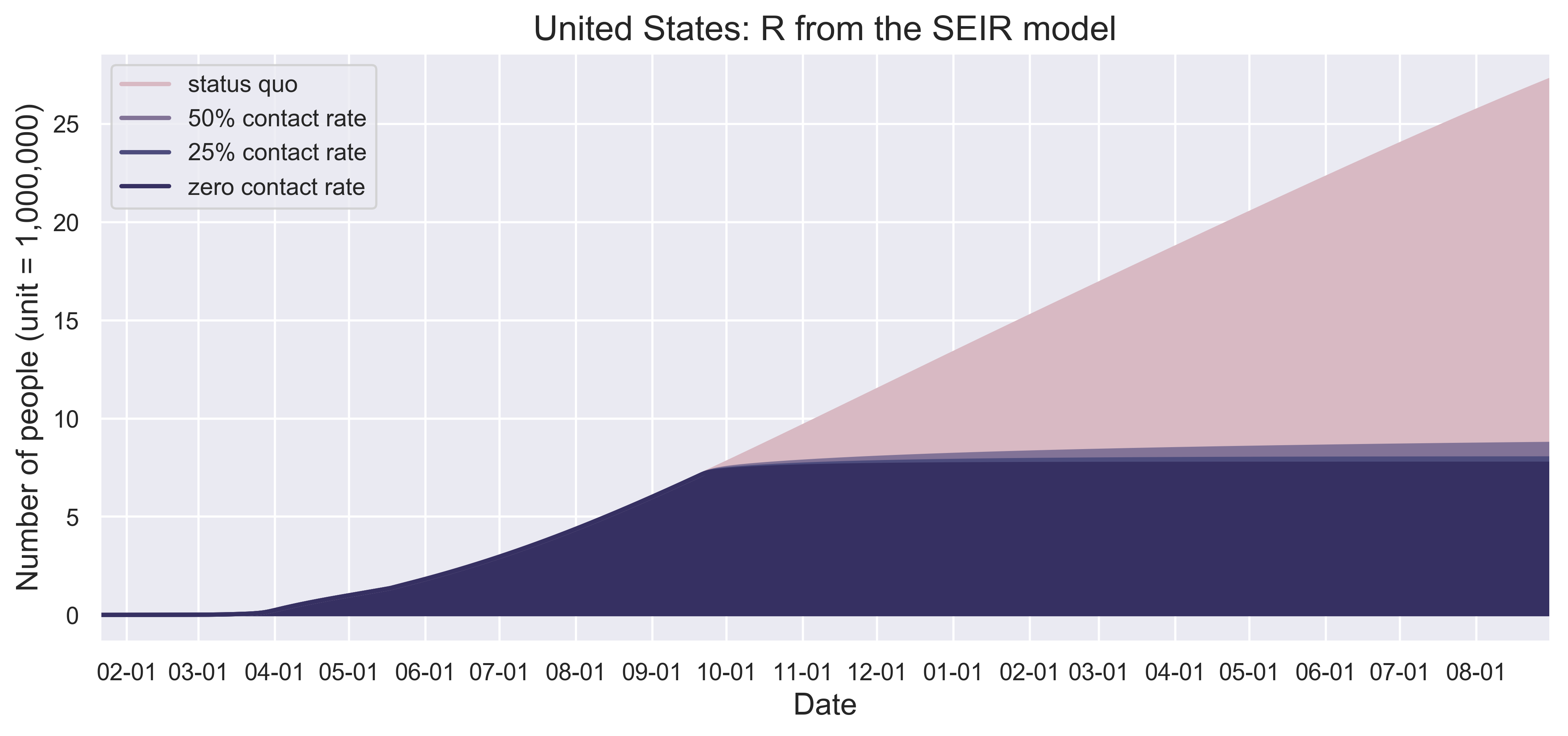
To what extend the contact rate was suppressed in China with three different scales (national, provincial, city) provide even more references to us. We further estimate the number of people infected (dead) under these contact rate reductions.
 |
|---|
| (a) Number of people infected in the end. If we let the outbreaks continue its current trajectory without any effective measures, the total infections can reach around 41 million. With 50% reduction rate, 9 million infection, and with 75% reductions, 8 million people would get infected. Even for the zero contact rate, around 7 million and 700 thousand cases. |
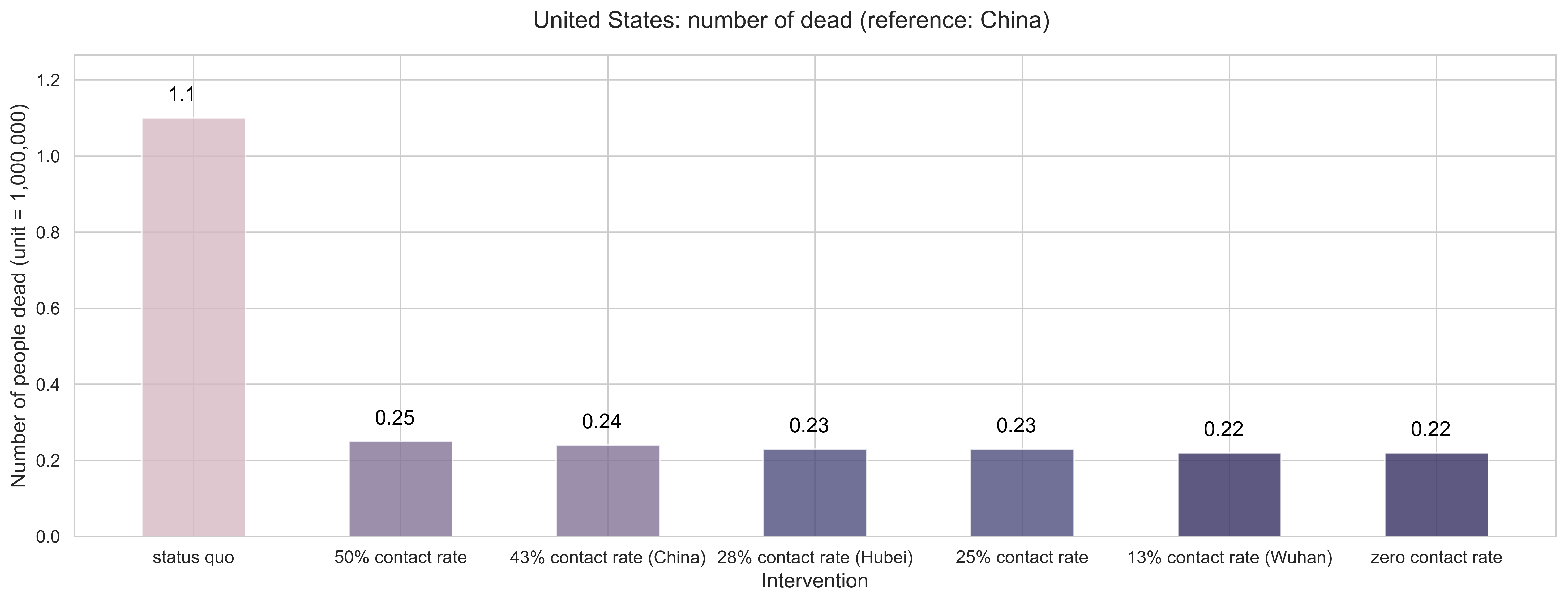 |
| (b) Number of people dead in the end. If we let the outbreaks continue its current trajectory without any effective measures, the total deaths can reach around 1 million and 100 thousand. With 50% reduction rate, 250 thousand deaths, and with 75% reductions, 230 thousand people would be dead. Even for the zero contact rate, 220 thousand deaths. |
| Figure 8: Mitigation effects by the numbers. |
Continuous Variation
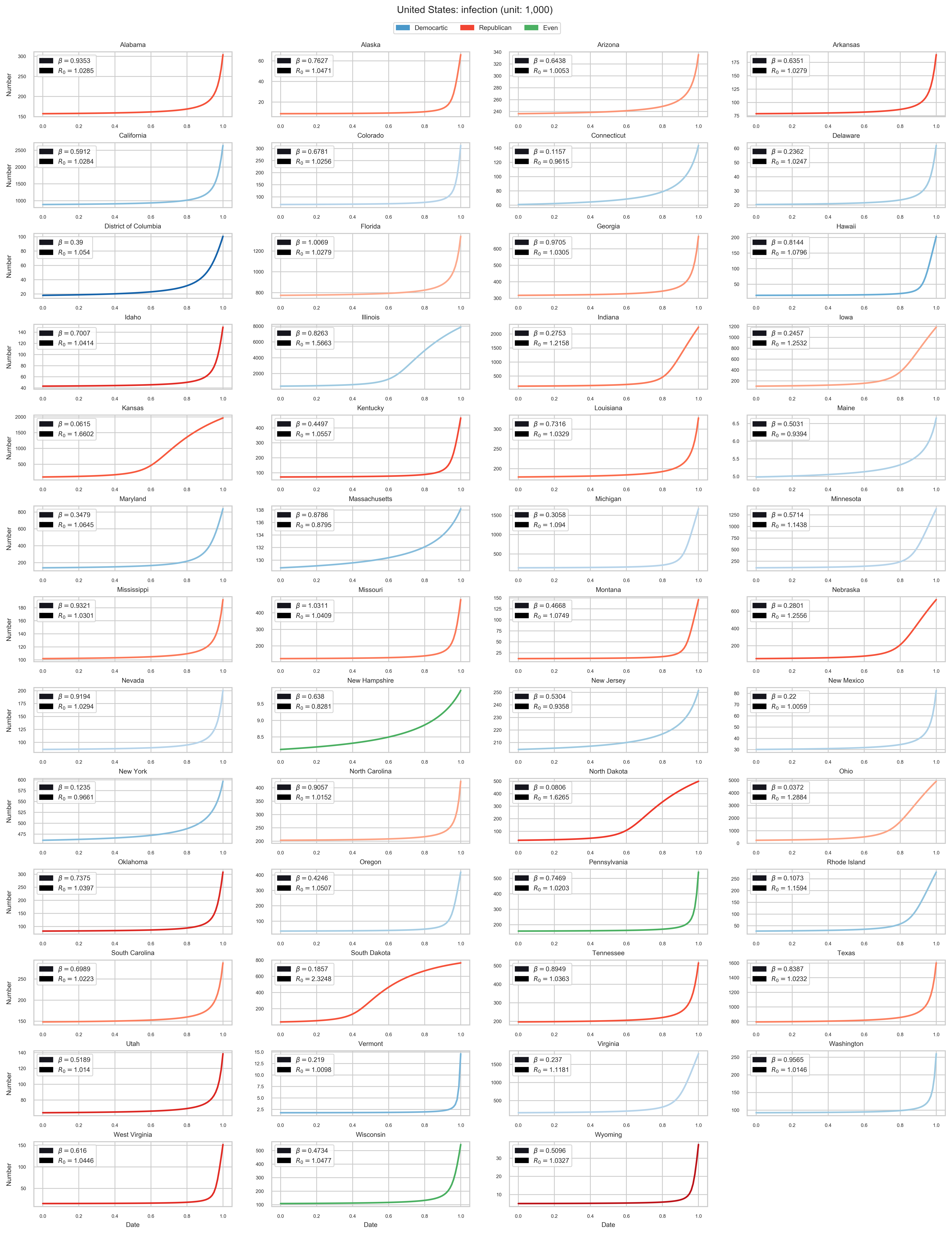
We can even consider any contact rate measured on a $[0, 1]$ scale. Here, $0$ stands for zero contact while $1$ means statuo quo contact.
 |
|---|
| Figure 9: How far do we need to push the quarantine? It may vary from state to state. The x axis indicates the contact rate and the y axis is the final number of infected. |
Old Results
- April 5, 2020
- April 12, 2020
- April 19, 2020
- April 26, 2020
- May 3, 2020
- May 10, 2020
- May 17, 2020
- May 24, 2020
- May 31, 2020
- June 7, 2020
- June 14, 2020
- June 21, 2020
- June 28, 2020
- July 05, 2020
- July 12, 2020
- July 19, 2020
- July 26, 2020
- August 2, 2020
- August 9, 2020
- August 16, 2020
- August 23, 2020
- August 30, 2020
- September 6, 2020
- September 13, 2020
- September 20, 2020
- September 27, 2020